The Wild Bird Indicators are annual reports on the state of the UK’s birds. Learn how to understand what the Indicator graphs and indices show.
Understanding the indicator graphs
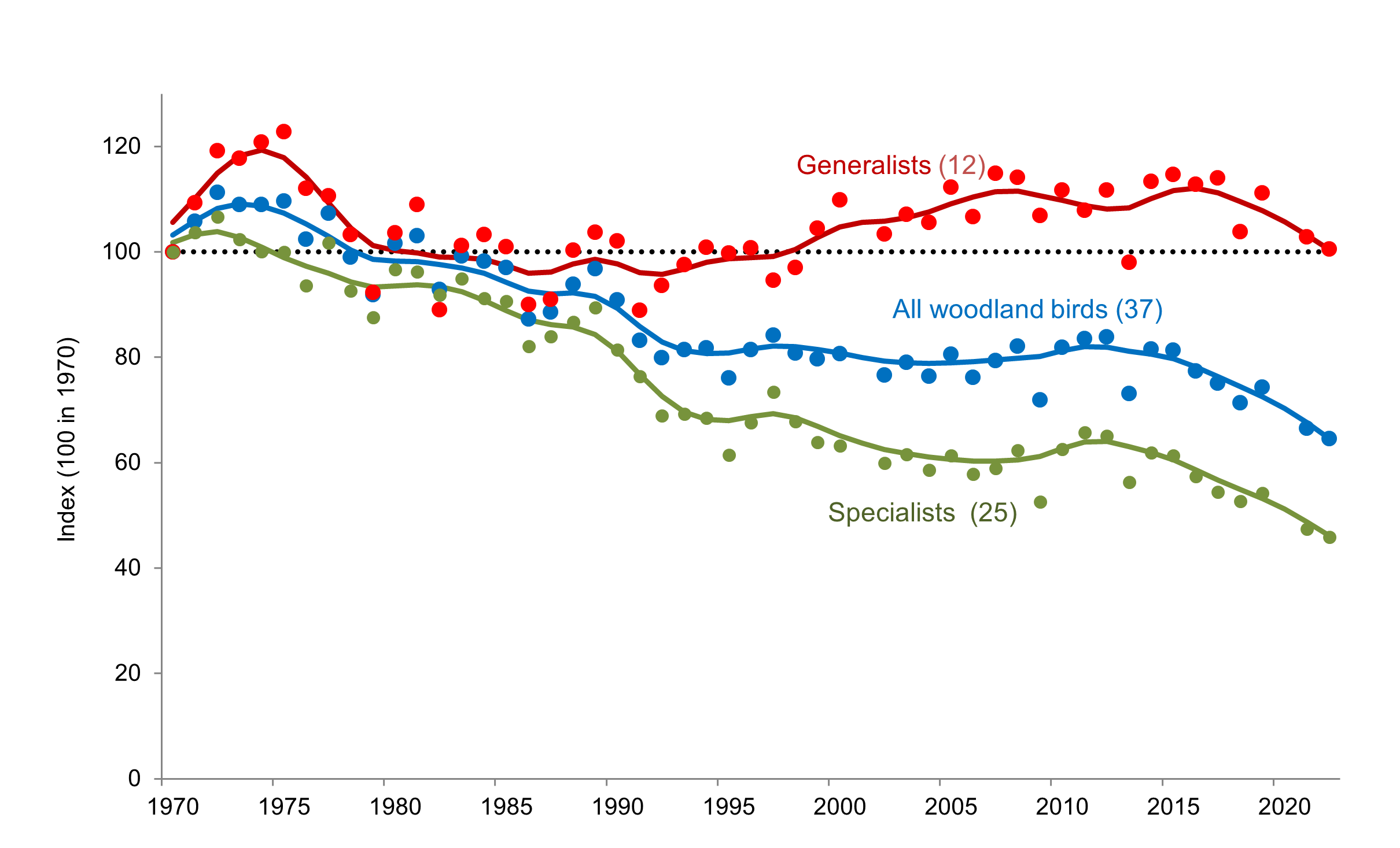
When looking at the graphs for each indicator, it is useful to bear the following in mind:
- Numbers in brackets refer to the number of species in each group (when associated with a specific line on the graph) or in the indicator as a whole (when associated with the graph title).
- The individual points on the graph show the specific value of the unsmoothed indicator for each year.
- The unbroken lines on the graph are known as the 'smoothed trend' and show the ‘line of best fit’ for the individual points. They allow us to see the overall trend in the indicator more clearly.
- A shaded area, or an area on either side of the smoothed trend line bordered by dotted lines, represents the 95% confidence interval, where this can be calculated. This is a statistical measure which represents a range of values around the smoothed trend; there is a 95% probability that the smoothed trend falls within this range. The narrower the confidence interval around the smoothed trend, the more confidence we have in that measure. This is not present on all the indicator graphs.
- The index shown on the graph does not represent the actual number of birds, but relates to an initial baseline population (see below).
What is an ‘index’?
By analysing the annual monitoring scheme data collected from the same sites, researchers can compare how bird populations are changing.
- The total estimated bird population at the beginning of the data period is known as a ‘baseline’.
- Changes to the population are measured using an ‘index’ – a percentage of the total estimated bird population at the beginning of the data period.
When you look at the indicator graphs, the values of the individual points and smoothed trend lines show you the population for each year as a percentage of the population size at the beginning of the dataset.
For example, if the value is around 20, that means that the current population size is only 20% of the baseline population size – in other words, the population has declined by 80%. Conversely, if the value is 120, that means the current population is 120% of the baseline population size – it has increased by 20%.
You will sometimes see the baseline population index value set to 1 instead of 100. In this instance, 1 is equivalent to 100%, 0.8 to 80% and so on.